A smart logo for a smart healthcare solution
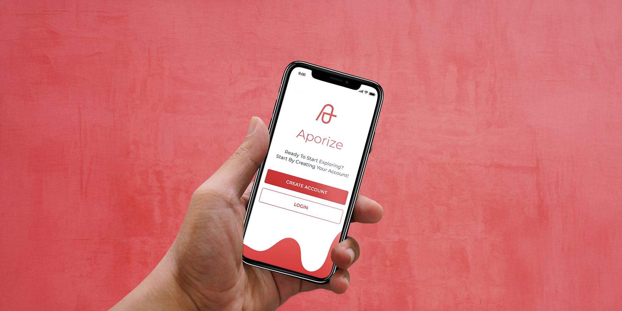
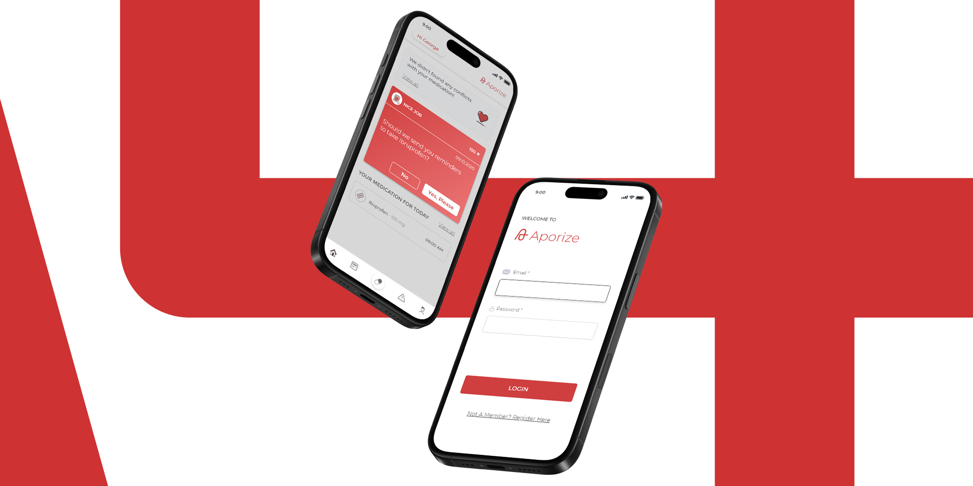
Aporize was a health tech start-up with a SaaS app for smart organisation of medication intake – including interaction checks, reminders and reorder notifications: a digital pharmacy for your pocket.
Challenge
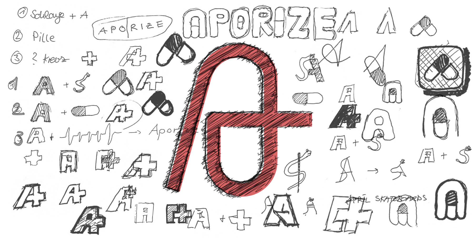
The aim was to create a logo that combines the medical context with the digital intelligence of the solution and the clear, accessible character of the product. It had to be modern, memorable and versatile – from the app icon to the website and classic print media. The design had to inspire confidence and at the same time visually convey the technolo- gical competence of the application.
Solution
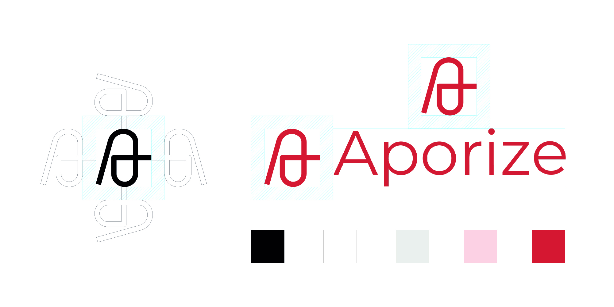
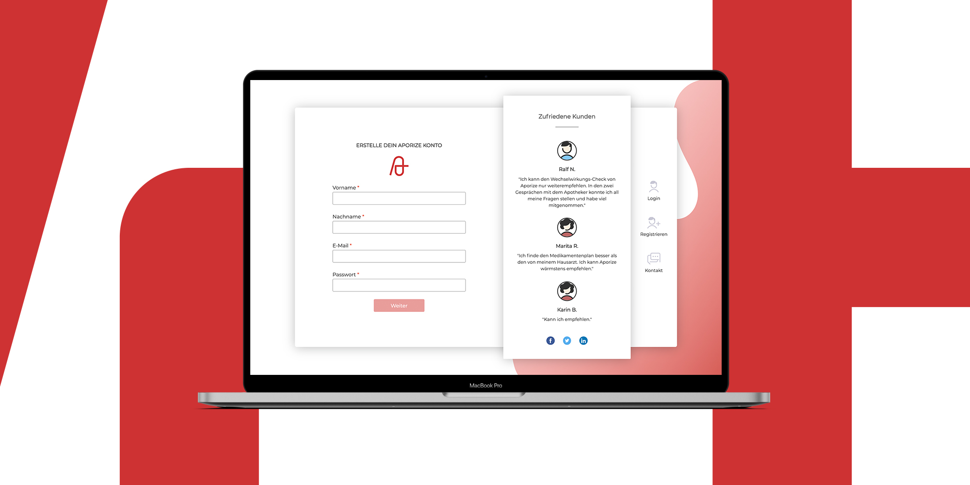
For Aporize, I developed a striking logo that combines three design elements: a distinctive “A” refers to the pharmacy context, while an integrated pill shape symbolises the intake of medication. The minimalist lines and bold red colour give the logo a modern, tech-savvy look. It works on its own or in combination with the lettering – from app icons to print products.
The logo is built around an iconic „A“ that serves a dual function, both as a recognizable initial and as a symbolic element. It blends trust, referencing the medical context, with a sense of lightness and clarity drawn from contemporary tech aesthetics. Acting as a visual interface, the logo bridges functionality, brand identity, and user accessibility, making it a key element in the overall experience.