Services around the house
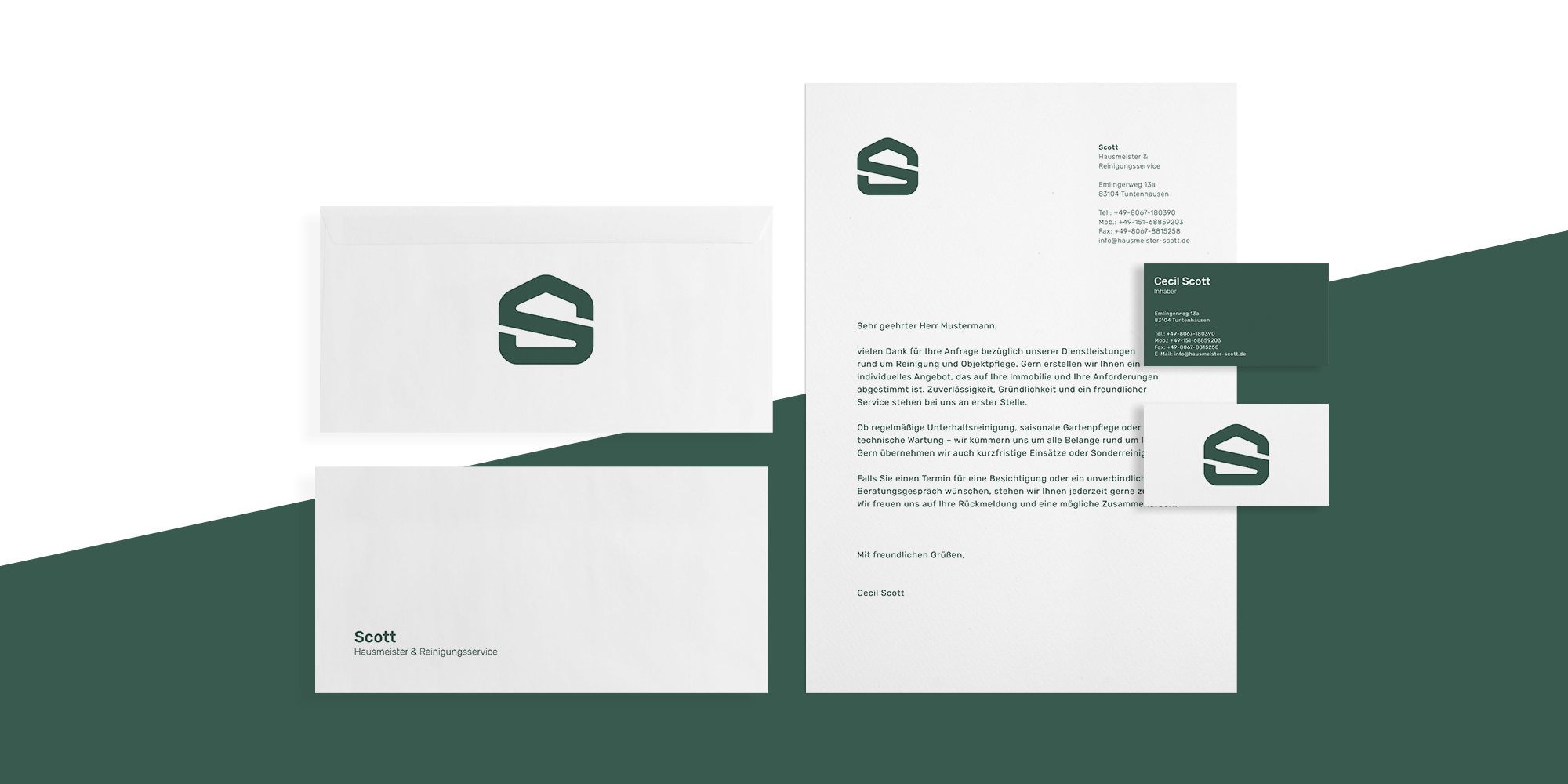
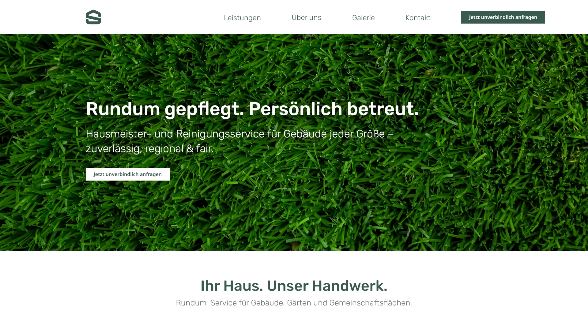
Scott was a regional caretaker and cleaning service specialising in comprehensive property care – both inside and outside. The family-run business stands for reliability, thoroughness and a personal approach to service.
Challenge
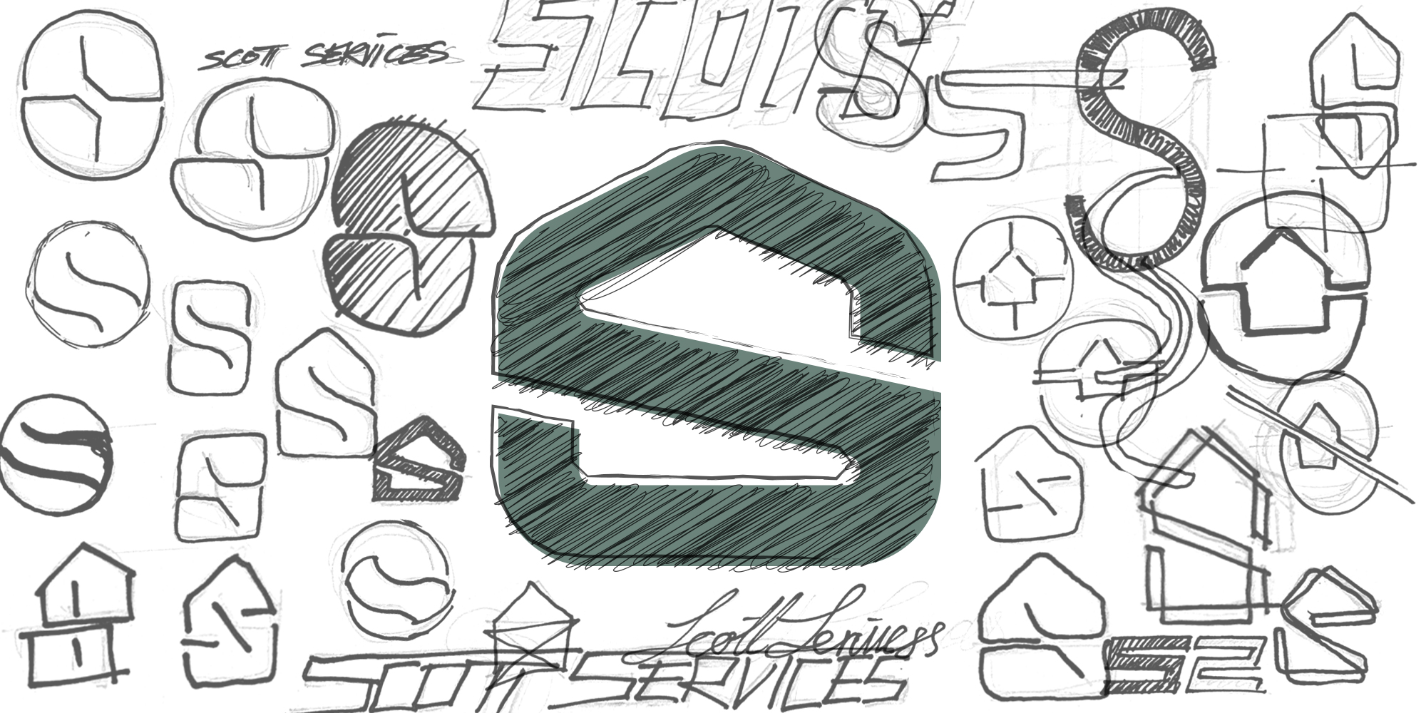
The goal was to create a logo that combines the personal character of the company with a clear, modern design. It needed to be instantly recognizable and reflect the full range of services in care, cleaning, and maintenance.
Solution
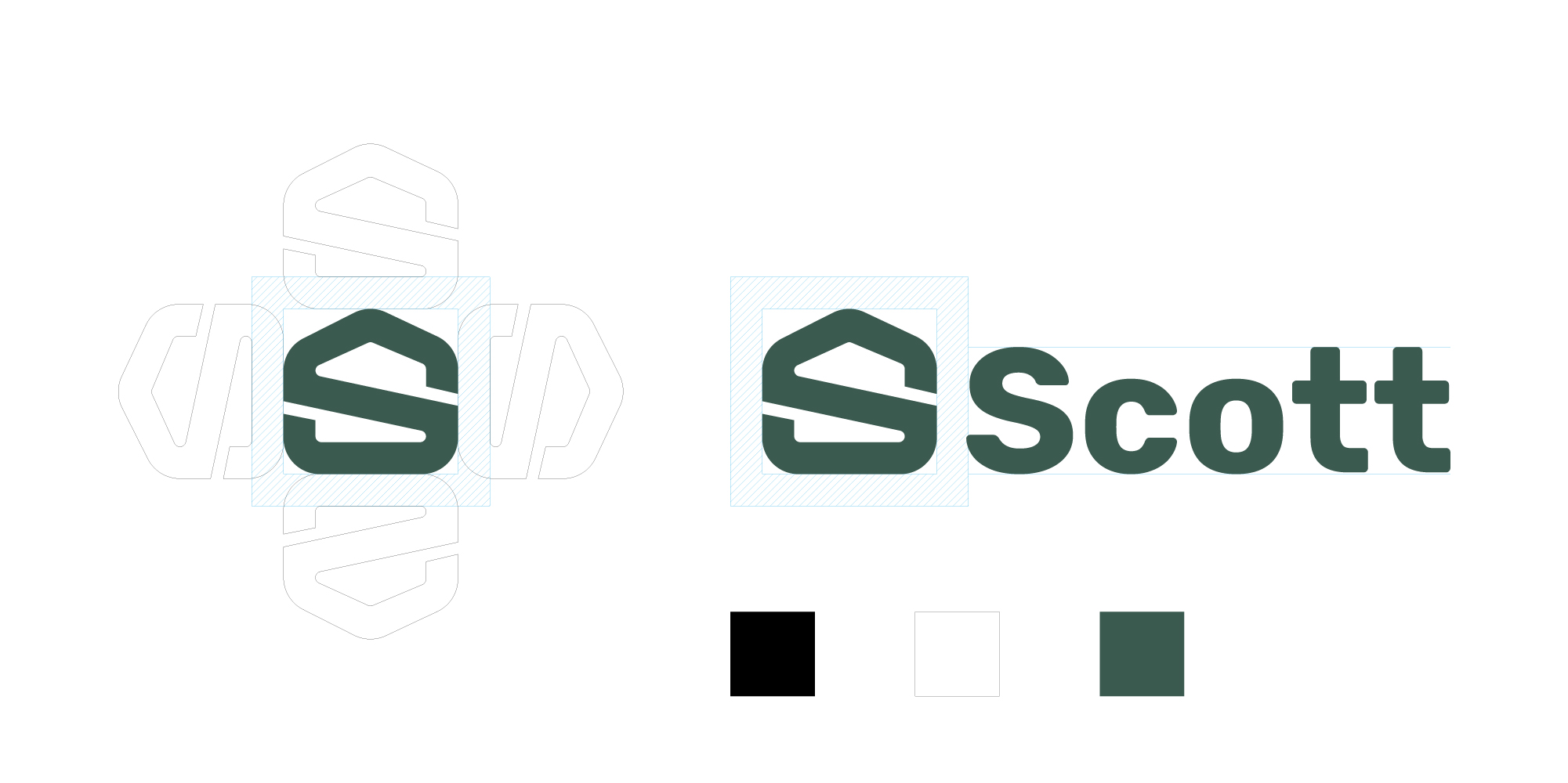
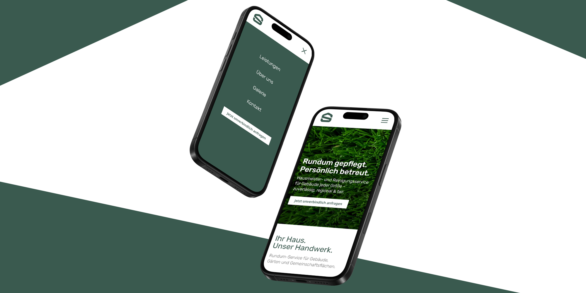
For the caretaker and cleaning service “Scott” I designed a striking logo that combines the letter “S”, for name and service, with the abstract silhouette of a house. The flowing lines convey dynamism, stability and a visual wholeness that radiates order, prudence and reliability. The modern, minimalist design and muted green colour give the logo a clear, down-to-earth feel – ideal for vehicles, clothing or digital applications.
The logo design achieves a high recognition value through the use of clear, distinctive symbolism. It conveys key brand attributes such as reliability, orderliness, and a strong service mindset. The result is a timeless visual mark that reflects the company’s grounded identity while signaling its forward-looking, future-oriented approach.